
This post is the second in a series about a legal information project we’ve been working on. This post is about analysing data. The first post is about collecting data.
To recap, the project is to extract deal data points from SPAs (things like warranty periods and de minimis thresholds), analyse the data over a period and then present the results to end users in a digestible way.
I’ve titled this post “analysing Small Data” and, over the last couple of years, I’ve been struck by how often I’ve been working with ‘small data’. We’re so used to reading about how we’re drowning in data that it comes as a surprise when you find that the dataset you’re interested in has, say, only 50 instances.
But this seems to happen quite a lot in law and I think it raises a couple of questions about how you analyse and present the data to users: how you design your output.
We’ve got a reasonable number of data points in our project (100s) but by the time you start filtering this down, e.g. “what’s market for a US PE seller with a trade purchaser on a mid-cap deal in industry X” you find the data dwindles. That doesn’t mean you can’t say anything at all: if there have only been three of these deals ever done there is still some precedent value – it’s just not as persuasive.
So, what are the points to think about when you’re analysing 10’s or low hundreds of data points?
Avoid summary statistics
Talking about the ‘average’ of a small number of data points usually isn’t helpful. That’s obvious when you have, say, three data points:
Data: warranty periods (where each “x” is a data point from an imaginary SPA)

And yet it’s also easy to imagine the pop-out in the client briefing:

The statement is true but, to anyone who has seen the underlying data, obviously meaningless.
Summary statistics remain tricky even with 10 times as much data:
Data: de minimis basket (also imaginary)

Is it helpful to know that the average of these data is 5.7%? Does that really reflect some sort of market consensus? I would be very sceptical of any such claim. It’s only sensible to talk about averages or other summary metrics when your data has a certain shape, and 30 data points generally isn’t enough to be confident in the shape.
Histograms are your friend
If not averages, then what? As noted above, it’s not that there’s no value in small amounts of data, but the focus should be on clearly describing it, rather than trying to draw statistical inferences. It needs to be presented in context so viewers can draw their own conclusions.
One way of doing that is to use histograms. In a histogram the data is separated into bins and we then chart the number of data points in each bin. For example:
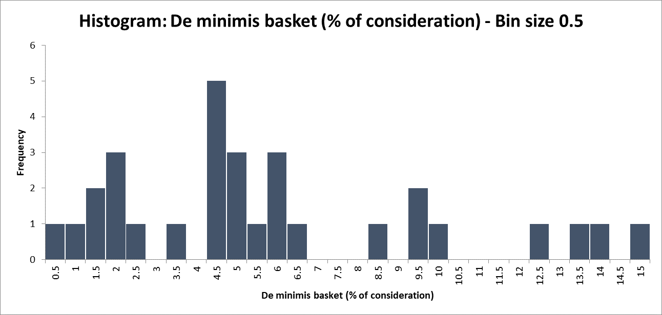
There is one value in our data between 0% and 0.5%, so the frequency for the ‘0.5% bin’ is 1. There are five values between 4% and 4.5%, so the frequency of the ‘4.5% bin’ is 5. The size of the bins is a choice to be made.
I like this presentation because it tells the viewer that there is a clump of values between 4% and 6.5%, but this clump isn’t so much larger than that around 2%, and there’s a not insignificant tail of values stretching out to 15%.
So it terms of the conclusions that a viewer might be able to draw:
- the bucket often ends up around 5% of consideration, but it’s not that unusual to go lower or a fair bit higher; and
- by contrast, if the purchaser suggests 20%, that would be out of step with anything that’s been seen before.
Embrace imprecision
I’ve adopted this phrase from Tim Harford’s ‘postcard-sized guide to statistics’ and, whilst it applies to statistics generally, it’s particularly pertinent for small data. The gist is, overly precise numbers can offer the illusion of certainty in highly uncertain situations. With small data, we have more uncertainty and so the risk of over-stating our conclusions is greater.
We can see that in the “52 months” claim above. There’s something authoritative about it. It makes it seem like we’re confident the answer is “52 months” and not “51 months”, when of course it is just the average of the three periods expressed in months rather than years. Would it be even more compelling as days?

Perhaps that stretches credulity too far.
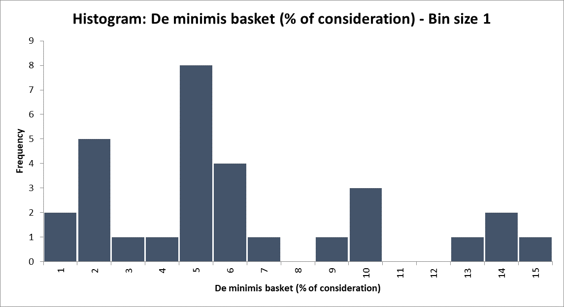
We should apply this lens to the histogram too. I’ve reported 0.5% bands, but is that level of precision justified (or necessary)? The informal conclusions I drew didn’t turn on half percentage points (just the difference between 5% and 20%).
And, actually, if I were to consider the data gathering process, I’d recall that some basket values were expressed in different currencies to the overall consideration. So deriving the “% of consideration” first required conversion, which almost certainly introduced rounding and uncertainty.
Re-drawing the histogram with a larger bin size is clearer and more appropriate to our level of certainty:
If you would like to share your own experiences, learn more or get involved, please get in touch at LegalDesign@SlaughterandMay.com.
 unknownx500

